Let Me Introduce Myself – Christen Joy Homes

Hey, y’all, I’m Christen Anderson of Christen Joy Homes!

I’m thrilled to have the pleasure to be a part of multiple Roers’ projects and to be featured as a guest blogger for them.

Before we jump into my work with Roers, let me tell you a bit about me!

I’m a Minnesota native that has always had an eye for décor and design.

After returning to the Midwest and deciding to build my home in Moorhead, I was able to put my knack for decorating into practice. While going through the home building process, I realized that I had a deep passion for all things décor and design.

After constantly being asked by friends to help with their home decorating projects, I finally decided to give it a go, and Christen Joy Homes was born.

It’s my unwavering passion for travel, art, and design — combined with my extensive marketing and project management background — that have created the foundation I’ve built my business on.

My Style

As an avid traveler who has been to 23 countries (and counting!), I have a broad approach to decorating. I love to bring what I’ve seen in my travels into the spaces I’m working on.

My personal style is what I like to call “beach chic.” I love pops of color, neutral “classic pieces” that include heirlooms, investment pieces, along with art or mementos from my travels. I see my home as an extension of me – full of personality.

I understand that not everyone has a giant budget to work with, but with a fresh coat of paint, new pillows, a throw, and flowers or a pop of greenery, a room can be transformed.

My Projects

I approach design for my clients with one key thing in mind: it should reflect the client, not me. It’s not my space, and I want the work I do to showcase the tastes of the people who hire me.

I’m passionate about helping my clients and ensuring each project is aligned with their unique vision. I love the opportunities each client brings to me, whether that’s a limited budget, asking for ideas that haven’t been seen in the Fargo-Moorhead area, or whipping something up on a short deadline.

Creativity is at the heart of what I do, and when I can start with a blank slate, it really allows me to shine and figure out new ways to make the most of the potential of the space.

My projects span everything from home staging, accessorizing living room spaces, working on full remodels, and new construction, for both commercial and residential spaces.

Creating the perfect-for-you space is all about using my keen eye for decor and your aesthetic to create that inviting space you’ve been dreaming about.

When I’m not busy working on design projects, I’m a passionate art collector, a keen traveler and love to host dinner parties at my home complete with floral arrangements, place settings, and delicious home-cooked meals.

Stay tuned for more guest blogs around my work with Roers. You can follow me on Instagram or Facebook, or contact me for more information for your own projects.


SGC Entryway Refresh: From Tired to Functional & Fabulous

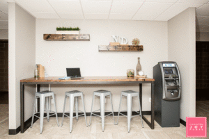
We recently gave the SGC lobby a new look! Thanks to the help of the amazing Christen Joy Homes, SGC has never looked better! Here’s what Christen had to say about working on this project:“One of my most recent projects was partnering with Roers to do an entryway revamp at the SGC Apartments.
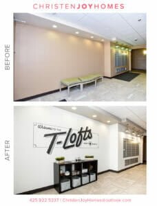
If you’re not already familiar with the building, the SCG Apartments include 25 unique floor plans of urban loft-style apartments, located close to the NDSU campus and the Fargodome. Residents range from students in their final year of college to young families and professionals, which makes for a diverse and interesting community.

In real estate, everyone knows it’s all about location, so being close to concerts, Bison games, and downtown, all while offering ample parking make this particular building extra appealing. It’s a great spot for people who work downtown or in North Fargo as it’s prime location also offers easy access to the interstate.

Best of all, the building is made of concrete, so it’s quiet, which is always a concern when it comes to apartment living.

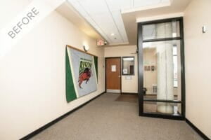
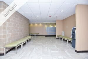
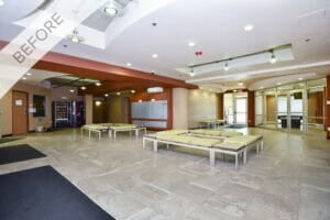
First Impressions of SGC

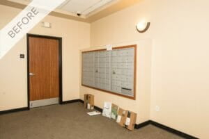
When I first saw the space at the SCG Apartments, I was immediately struck by what a great foundation I was being given to work with.

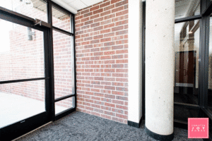
There were so many unique features for me highlight, including exposed brick and tray ceilings. The challenge was that the space lacked personality and functionality — two things that are “must haves” when it comes to your living space.

To make this building stand out and really showcase what it had to offer, I knew I needed to echo Roers’ unique brand and lifestyle. My goal was to create a wow factor in the entryway, so it would welcome residents while being functional for the high level of foot traffic and volume of deliveries.

The Plan

First, I needed a concept. I determined the needs of the space and used that as my jumping off point to come up with a perfect blend of functional and “Wow, this place is awesome!”

My concept for the entryway was “a breath of fresh air.” I wanted people to feel relaxed and calm when they walked into the space.

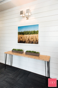
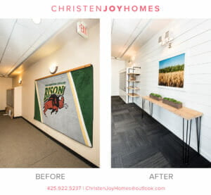
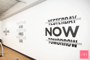
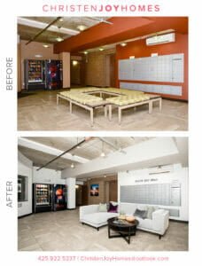
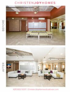
To create this vibe, I recommended white walls and black flooring for a high-contrast statement which makes the walls feel ever more crisp and vibrant! Then, I wanted to use North Dakota oriented photography that highlights the state outside of the city.

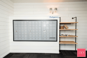
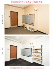
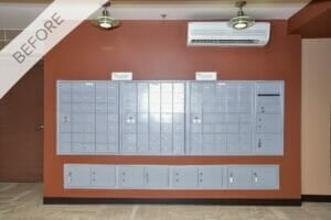
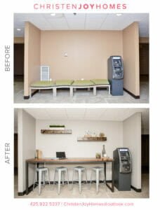
I thought a new built-in next to the mailboxes could be used for deliveries so that they’d stay dry and out of the common walkway. I also wanted to include a splash of greenery that welcomes people on their way in and out of the elevator, along with a mirror so they can take a glance before they head out.

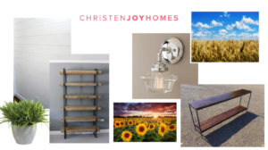
I began my process by creating a mood board to pull my ideas together and to give Roers a vision for the entryway.

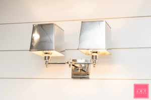
As you can see, this included shiplap walls, natural wood shelving, polished nickel lighting for a bit of bling (or as I call it jewelry) for the project.

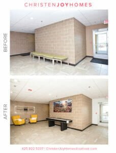
I knew I’d be able to find photography that highlighted North Dakota nature and had vibrant colors and would look great off what would be all white walls.

Putting It All Together

Once the look was approved, I started looking for the perfect items to make the vision come to life.

Carpet

I chose to go with a mix of black with dark grays as this was key to creating the high contrast concept we were looking for. It’s also perfect for high traffic areas for wear and tear, like a lobby/entryway.

Paint

For the shiplap: Alabaster from Sherwin Williams 7008

For the mailbox trim: Tricorn Black from Sherwin Williams 6258

Furniture

I worked with Grain Designs to bring my ideas to life. With the natural wood options and dark piping that echoed the high contrast look I was going for it was the built in shelves they created were the perfect match for the mailbox area.

I also had Grain Designs create a matching table that’s light enough to move when renters are moving in or out. It was important for the small, high traffic space to remain practical.

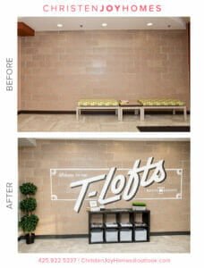
The Grain Designs team created custom built-in shelves next to the mailboxes that offered equal amounts of character and functionality. The natural wood paired with dark piping provided the perfect solution to store the deliveries that had previously been placed on the floor.
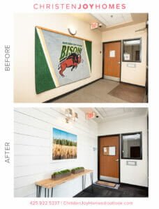
Photography

A little secret I discovered is that Grant Koenig of Grain Designs is also a photographer! I mentioned to him what I was looking for, and he had the perfect piece to highlight the “outside of the city limits” theme I was going for with grains of wheat, stalks of corn, and that blue, blue North Dakota sky. What a stroke of luck!

The Jewelry (aka Lighting)

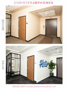
If you look closely, you’ll see that we squared up the top of the mailboxes for a more contemporary look.

To echo the clean design and to include lighting that was a conversation piece, I went with two Restoration Hardware polished nickel sconces, the Double Claridge with metal shades. They’re elegant enough for a hotel and take this entryway to a new level.

Accessorizing

For the SGC entryway, I wanted to add a bit more fun to what was already a great refresh, so I pulled in two of my favorites vendors, Cory and Jared of Upper Hand Signs.

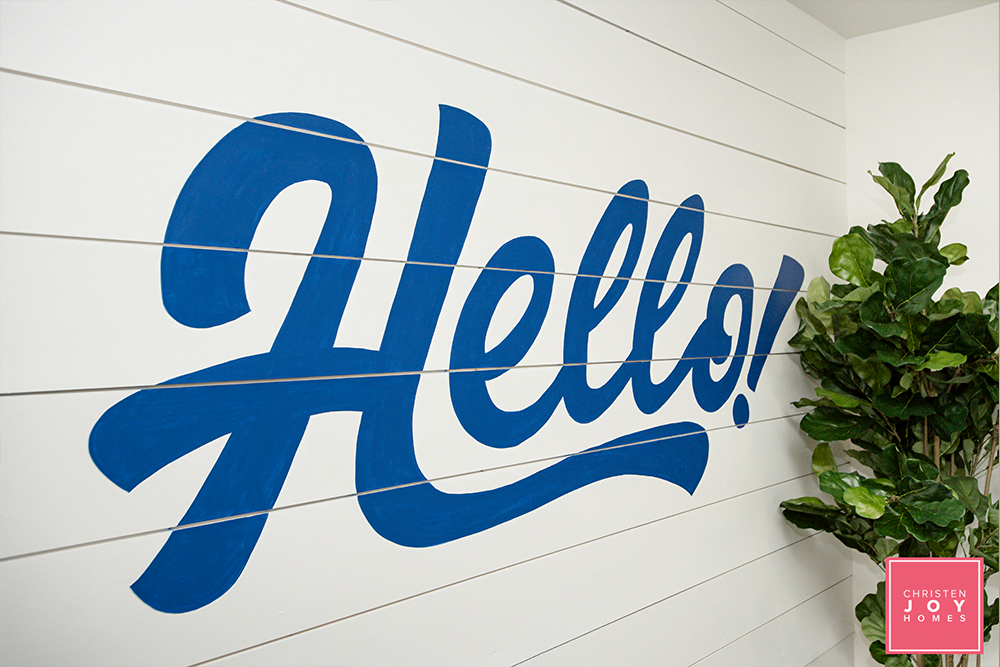
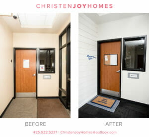
I added a “Hello” sign in a fun, flowing styled font near the elevator that can also be seen in the new mirror as you walk in. In addition, they replaced placards with mini-pieces of artwork and arrows.

For a pop of greenery, I added a large fiddle leaf tree from Wayfair with a Restoration Hardware planter topped with moss for a finished look. I also brought in two unique moss planters for the entryway table. Again, these are easy to relocate temporarily should people be moving in/out or should Roers want to set something out like they tend to do, such as free breakfast, snacks or other treats.

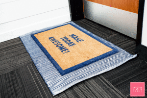
Often, people forget to add finishing touches from top to bottom, so I layered two rugs for a bit of interest, including one with a fun saying “Make Today Awesome!”

The End Result

If you’ve read about Christen Joy Homes in the past, you know I love working with clients that embrace color, personality, and creativity! Roers has been an amazing client as they let me run with my ideas and trust my instincts.

Any project always comes with its challenges, and for this one, it was the size and use of the space. It challenged me to get creative to ensure I added personality while keeping the space functional.

When I asked Danielle Paulus, the Director of Roers Property Management, what she thought of the final results, she had this to say: “What a difference! The feel of the building completely transformed with the smart efficient changes that were made. Christen was able to take something dated and bring it back to life with a clean and modern feel. We love the renewed feeling of the crisp and clean space — it’s fresh and welcoming.

By making sure each selection was a unique and purposeful enhancement, I was able to achieve the end result Roers was looking for. Personally, I was thrilled to see my vision come to life, and I know it exceeded the expectations of my clients and the residents of the building.”

__________________________________________________________________________________________________________________

If you’re interested in any of the materials I used, here’s the complete list:

Stay tuned for more guest blogs around my work with Roers. You can follow me on Instagram or Facebook, or contact me for more information for your own projects.

The T Lofts Transformation: Modern Comfort Near NDSU

Roers partnered with Christen Joy Homes for this project! We are so satisfied with how it turned out. Here’s what Christen had to say about the process!“As a decorator, one of the most exciting things about working with clients is when they ask me to revamp and redesign existing spaces. So when Roers asked me to work on updating some of the spaces in the T Lofts Apartments, I was excited to transform the space and give it some personality!The goal of the T Lofts refresh was to create inviting common spaces, with a focus on providing a comfortable space for residents to enjoy.

Located right on the edge of the NDSU Campus, the primary occupants of T Lofts are college students. The design needed to be creative, student-friendly and instantly inviting.

The refresh project included two entrance common areas, communal restroom, and the exercise room – plenty of spaces to bring my ideas to life!

Roers granted me the freedom and flexibility to truly take this project in any direction I wanted. Throughout the project, I maintained consistent communication and had frequent checkpoints to ensure we were all on the same page.

Bringing the Local Flavor

For the T-Lofts design, I wanted the space to include hints of local North Dakota flavor coupled with sustainable yet modern comfort and welcoming, vibrant character.

I’m a big believer in including local talent whenever possible, and this project was the perfect place for me to show some of the amazing design pieces this community has to offer.

Inspired by their work on Roberts Alley in Downtown Fargo, I called upon Upper Hands Signs to use the concrete walls as a canvas throughout the space.

The hand-painted wall art is used to highlight the T-Lofts logo while serving up some North Dakota pride. We also added quirk and personality in unexpected places, such as the mailboxes and exercise room.

I layered in photography from J. Alan Paul and custom wood furniture from Grain Designs to create an instant wow factor and feature these local artists.

Sustainable, Modern Comfort

When you’re working on a common space that’s going to see a lot of traffic, sustainability is key. You want furniture that is not only well-made but will also stand up over time. In the open common areas at the T-Lofts, I opted for large sectionals and wingback chairs to provide ample seating with the right amount of color, texture, and comfort.

Paired with a custom high-top table are industrial stools which add to the overall design while being practical.

The restroom refresh included two full walls of high-gloss subway tile creating a fresh and clean vibe. I layered in a fun puppy print to provide a fun, unexpected twist in the restroom.

Vibrant and Welcoming Character

The most well-loved communal spaces have one thing in common: they’re welcoming. My goal was to make these spaces not only visually appealing but to make them places that people would want to spend time.

By including extra touches, such as a shuffleboard gaming center and a bookcase unit displaying local magazines, we signaled to residents they were welcome to use and enjoy the space.

For the exercise room, we installed large mirrors and arranged the equipment to better fit the space. The result was an immediate transformation.

The Final Product

For this project, the challenge was to find the right balance between making it inviting and keeping it comfortable while still ensuring the pieces had great durability. Trying to meet all three of these goals certainly pushed the boundaries of my creativity.

While I personally was thrilled with the final results, in the end, it’s the client’s opinion that matters the most. Roers wanted a refresh that would offer residents an inviting and comfortable space to use and enjoy, and at the end of the project, I was confident I had delivered.

The day following project completion, residents were taking photos of the wall paintings, conversing on the couches, and playing shuffleboard. Seeing their excitement and how they were using the space meant the mission for the refresh had been accomplished.

While I loved the creativity this project required, it was the opportunity to incorporate so many local, talented artists that brought me so much joy. Their talents made my vision a reality, and knowing I’ve created an ongoing showcase for their work is so gratifying.”

__________________________________________________________________________________________________________________

If you’re interested in any of the businesses used for this project, here’s the complete list:

 Stay tuned for more guest blogs around my work with Roers. You can follow me on Instagram or Facebook, or contact me for more information for your own projects.