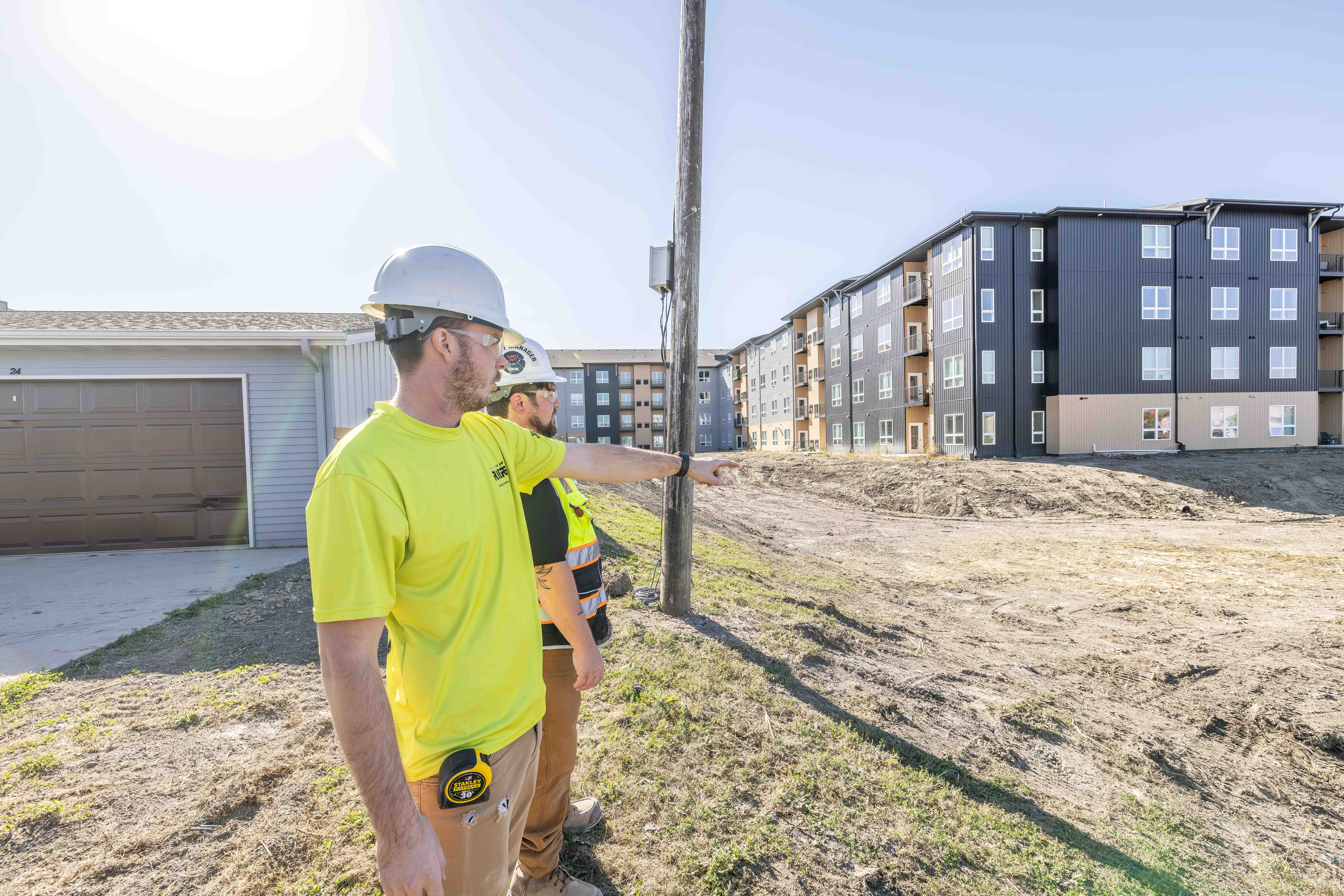
In real estate, everyone knows it’s all about location, so being close to concerts, Bison games, and downtown, all while offering ample parking make this particular building extra appealing. It’s a great spot for people who work downtown or in North Fargo as it’s prime location also offers easy access to the interstate.
Best of all, the building is made of concrete, so it’s quiet, which is always a concern when it comes to apartment living.
First Impressions of SGC
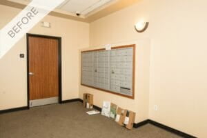
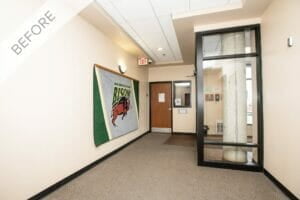
When I first saw the space at the SCG Apartments, I was immediately struck by what a great foundation I was being given to work with.
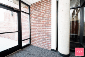
There were so many unique features for me highlight, including exposed brick and tray ceilings. The challenge was that the space lacked personality and functionality — two things that are “must haves” when it comes to your living space.
To make this building stand out and really showcase what it had to offer, I knew I needed to echo Roers’ unique brand and lifestyle. My goal was to create a wow factor in the entryway, so it would welcome residents while being functional for the high level of foot traffic and volume of deliveries.
The Plan
First, I needed a concept. I determined the needs of the space and used that as my jumping off point to come up with a perfect blend of functional and “Wow, this place is awesome!”
My concept for the entryway was “a breath of fresh air.” I wanted people to feel relaxed and calm when they walked into the space.
To create this vibe, I recommended white walls and black flooring for a high-contrast statement which makes the walls feel ever more crisp and vibrant! Then, I wanted to use North Dakota oriented photography that highlights the state outside of the city.
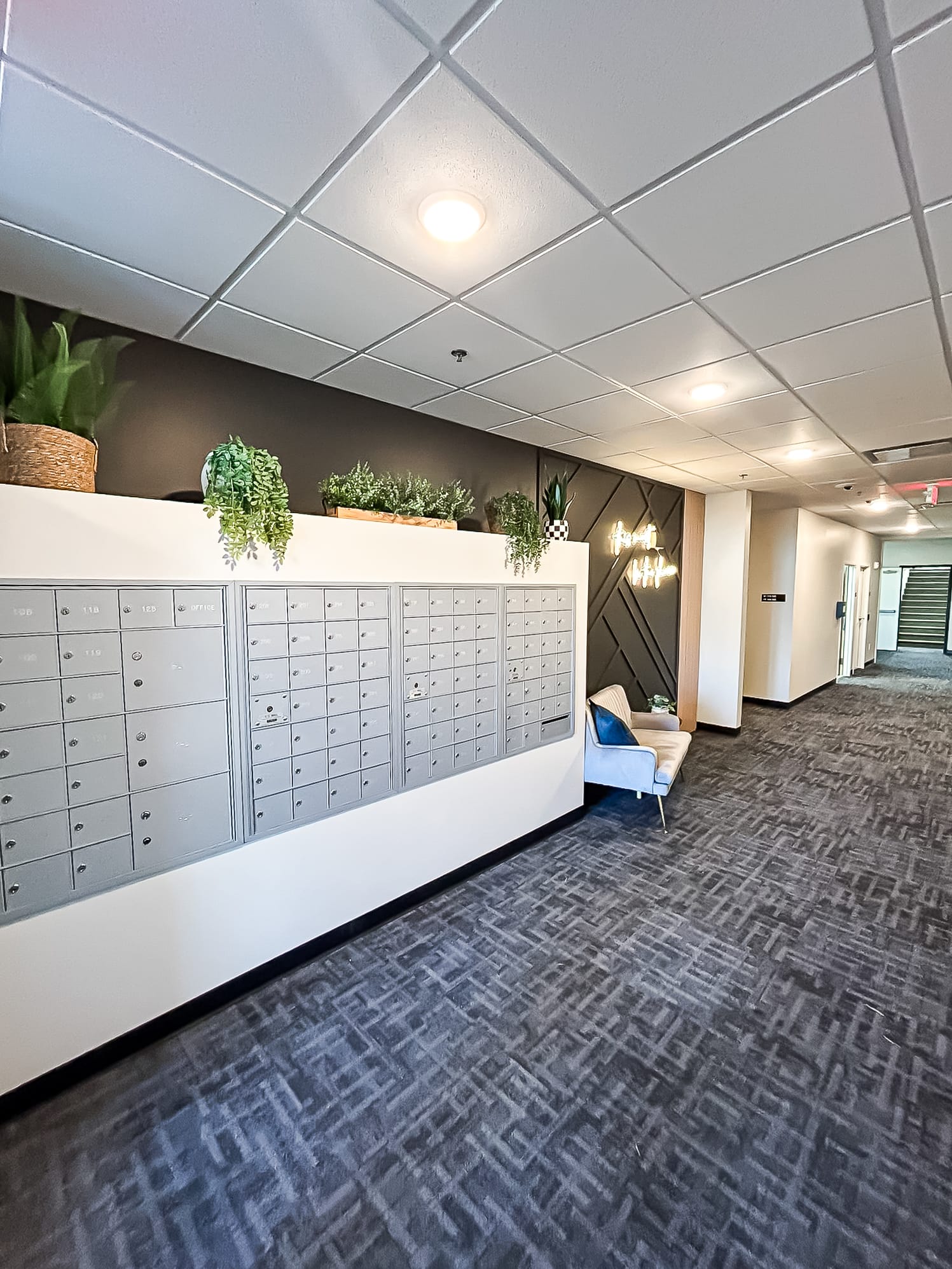
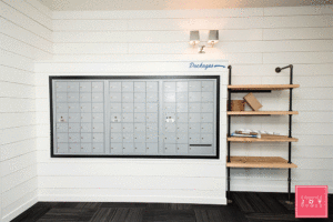
I thought a new built-in next to the mailboxes could be used for deliveries so that they’d stay dry and out of the common walkway. I also wanted to include a splash of greenery that welcomes people on their way in and out of the elevator, along with a mirror so they can take a glance before they head out.
I began my process by creating a mood board to pull my ideas together and to give Roers a vision for the entryway.
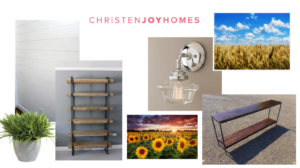
As you can see, this included shiplap walls, natural wood shelving, polished nickel lighting for a bit of bling (or as I call it jewelry) for the project.
I knew I’d be able to find photography that highlighted North Dakota nature and had vibrant colors and would look great off what would be all white walls.
Putting It All Together
Once the look was approved, I started looking for the perfect items to make the vision come to life.
Carpet
I chose to go with a mix of black with dark grays as this was key to creating the high contrast concept we were looking for. It’s also perfect for high traffic areas for wear and tear, like a lobby/entryway.
Paint
For the shiplap: Alabaster from Sherwin Williams 7008
For the mailbox trim: Tricorn Black from Sherwin Williams 6258
Furniture
I worked with Grain Designs to bring my ideas to life. With the natural wood options and dark piping that echoed the high contrast look I was going for it was the built in shelves they created were the perfect match for the mailbox area.
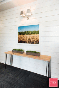
I also had Grain Designs create a matching table that’s light enough to move when renters are moving in or out. It was important for the small, high traffic space to remain practical.
The Grain Designs team created custom built-in shelves next to the mailboxes that offered equal amounts of character and functionality. The natural wood paired with dark piping provided the perfect solution to store the deliveries that had previously been placed on the floor.
Photography
A little secret I discovered is that Grant Koenig of Grain Designs is also a photographer! I mentioned to him what I was looking for, and he had the perfect piece to highlight the “outside of the city limits” theme I was going for with grains of wheat, stalks of corn, and that blue, blue North Dakota sky. What a stroke of luck!
The Jewelry (aka Lighting)
If you look closely, you’ll see that we squared up the top of the mailboxes for a more contemporary look.
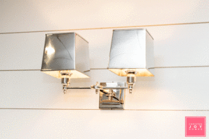
To echo the clean design and to include lighting that was a conversation piece, I went with two Restoration Hardware polished nickel sconces, the Double Claridge with metal shades. They’re elegant enough for a hotel and take this entryway to a new level.
Accessorizing
For the SGC entryway, I wanted to add a bit more fun to what was already a great refresh, so I pulled in two of my favorites vendors, Cory and Jared of Upper Hand Signs.
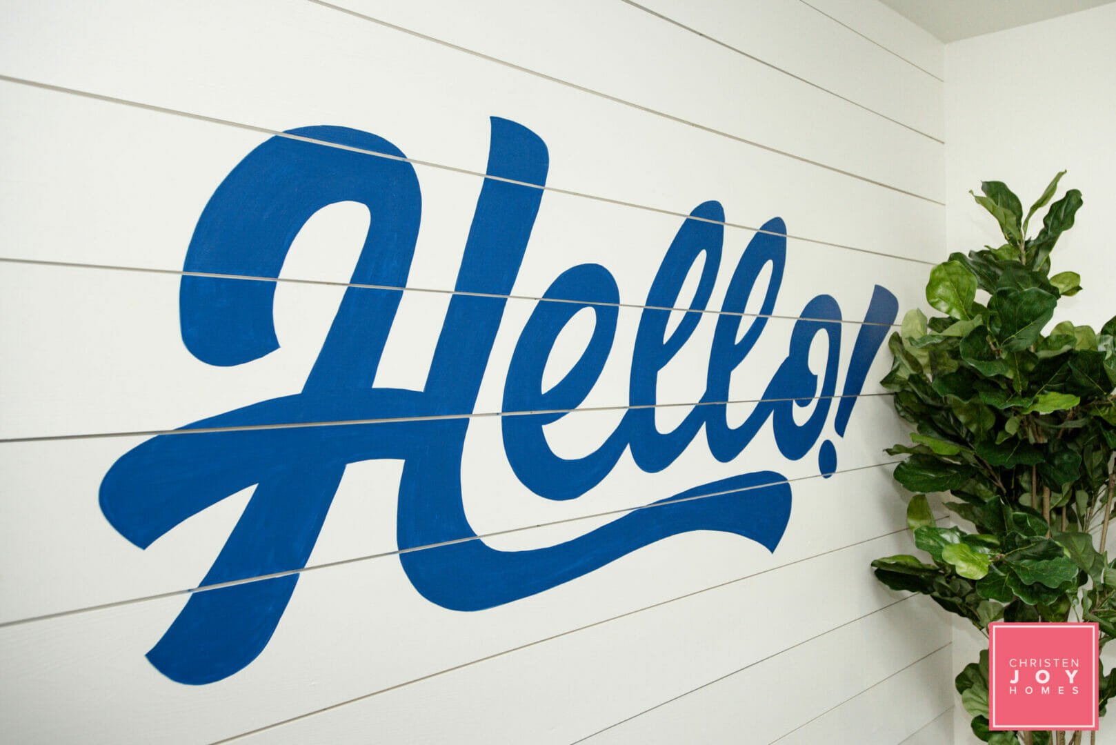
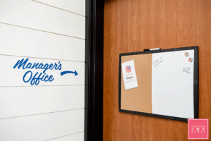
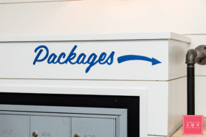
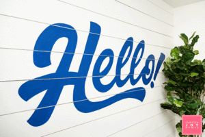
I added a “Hello” sign in a fun, flowing styled font near the elevator that can also be seen in the new mirror as you walk in. In addition, they replaced placards with mini-pieces of artwork and arrows.
For a pop of greenery, I added a large fiddle leaf tree from Wayfair with a Restoration Hardware planter topped with moss for a finished look. I also brought in two unique moss planters for the entryway table. Again, these are easy to relocate temporarily should people be moving in/out or should Roers want to set something out like they tend to do, such as free breakfast, snacks or other treats.
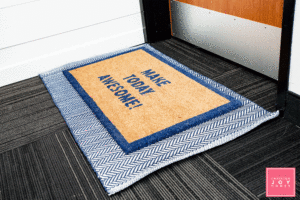
Often, people forget to add finishing touches from top to bottom, so I layered two rugs for a bit of interest, including one with a fun saying “Make Today Awesome!”
The End Result
If you’ve read about Christen Joy Homes in the past, you know I love working with clients that embrace color, personality, and creativity! Roers has been an amazing client as they let me run with my ideas and trust my instincts.
Any project always comes with its challenges, and for this one, it was the size and use of the space. It challenged me to get creative to ensure I added personality while keeping the space functional.
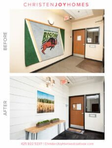
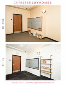
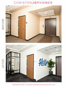
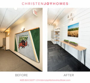
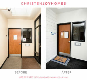
When I asked Danielle Paulus, the Director of Roers Property Management, what she thought of the final results, she had this to say: “What a difference! The feel of the building completely transformed with the smart efficient changes that were made. Christen was able to take something dated and bring it back to life with a clean and modern feel. We love the renewed feeling of the crisp and clean space — it’s fresh and welcoming.”
By making sure each selection was a unique and purposeful enhancement, I was able to achieve the end result Roers was looking for. Personally, I was thrilled to see my vision come to life, and I know it exceeded the expectations of my clients and the residents of the building.”
__________________________________________________________________________________________________________________
If you’re interested in any of the materials I used, here’s the complete list:
- Paint – Alabaster from Sherwin Williams 7008
- Paint – Tricorn Black from Sherwin Williams 6258
- Furniture – Grain Designs
- Photography – Grant Koenig, Grain Designs
- Lighting – Restoration Hardware
- Painted Wall Text – Upper Hand Designs
- Fiddle Leaf Tree – Wayfair
- Planter – Restoration Hardware
Stay tuned for more guest blogs around my work with Roers. You can follow me on Instagram or Facebook, or contact me for more information for your own projects.

