Roers partnered with Christen Joy Homes for this project! We are so satisfied with how it turned out. Here’s what Christen had to say about the process!
“As a decorator, one of the most exciting things about working with clients is when they ask me to revamp and redesign existing spaces. So when Roers asked me to work on updating some of the spaces in the T Lofts Apartments, I was excited to transform the space and give it some personality!
The goal of the T Lofts refresh was to create inviting common spaces, with a focus on providing a comfortable space for residents to enjoy.
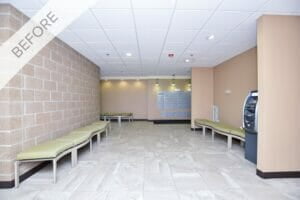
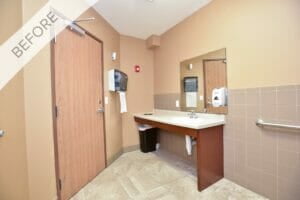
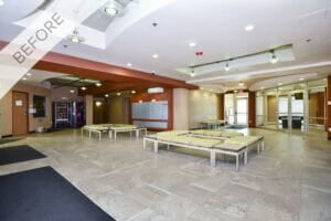
Located right on the edge of the NDSU Campus, the primary occupants of T Lofts are college students. The design needed to be creative, student-friendly and instantly inviting.
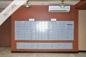
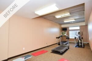
The refresh project included two entrance common areas, communal restroom, and the exercise room – plenty of spaces to bring my ideas to life!
Roers granted me the freedom and flexibility to truly take this project in any direction I wanted. Throughout the project, I maintained consistent communication and had frequent checkpoints to ensure we were all on the same page.
Bringing the Local Flavor
For the T-Lofts design, I wanted the space to include hints of local North Dakota flavor coupled with sustainable yet modern comfort and welcoming, vibrant character.
I’m a big believer in including local talent whenever possible, and this project was the perfect place for me to show some of the amazing design pieces this community has to offer.
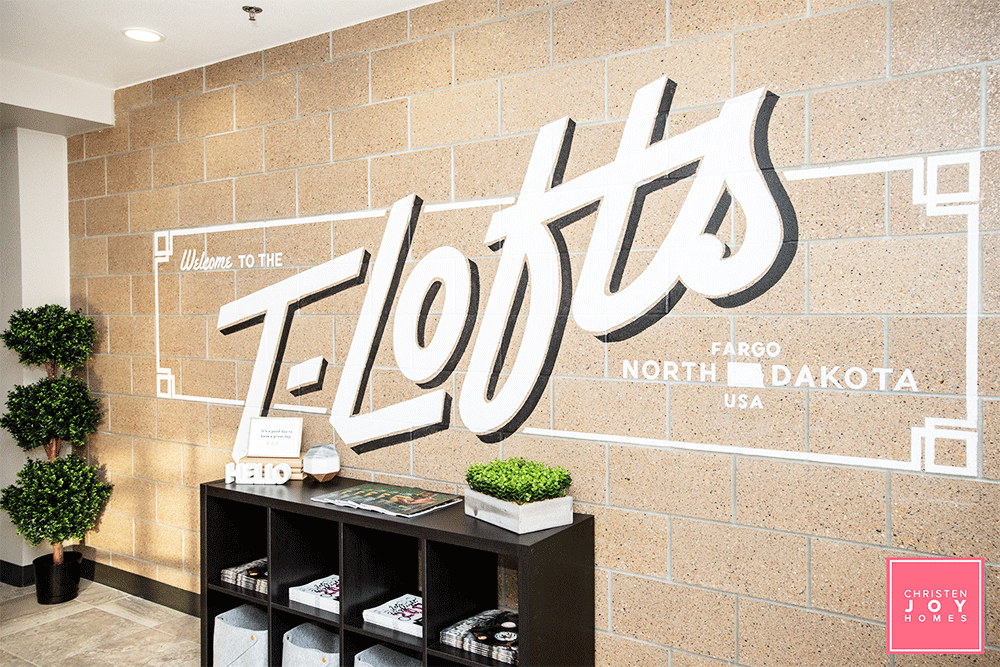
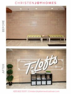
Inspired by their work on Roberts Alley in Downtown Fargo, I called upon Upper Hands Signs to use the concrete walls as a canvas throughout the space.

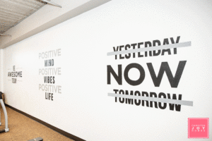
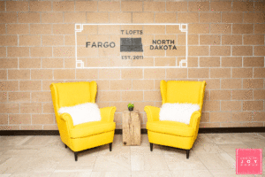
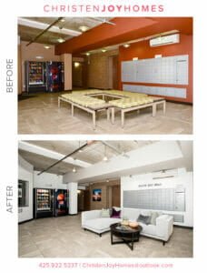
The hand-painted wall art is used to highlight the T-Lofts logo while serving up some North Dakota pride. We also added quirk and personality in unexpected places, such as the mailboxes and exercise room.
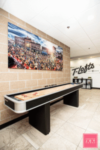
I layered in photography from J. Alan Paul and custom wood furniture from Grain Designs to create an instant wow factor and feature these local artists.
Sustainable, Modern Comfort
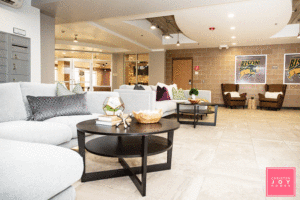
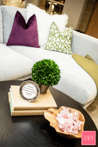
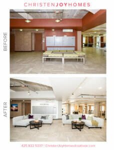
When you’re working on a common space that’s going to see a lot of traffic, sustainability is key. You want furniture that is not only well-made but will also stand up over time. In the open common areas at the T-Lofts, I opted for large sectionals and wingback chairs to provide ample seating with the right amount of color, texture, and comfort.
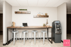
Paired with a custom high-top table are industrial stools which add to the overall design while being practical.
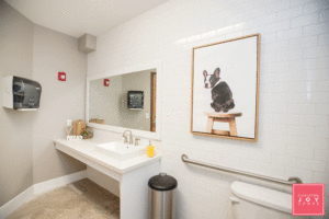
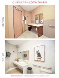
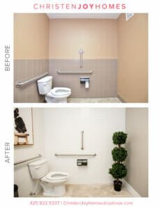
The restroom refresh included two full walls of high-gloss subway tile creating a fresh and clean vibe. I layered in a fun puppy print to provide a fun, unexpected twist in the restroom.
Vibrant and Welcoming Character
The most well-loved communal spaces have one thing in common: they’re welcoming. My goal was to make these spaces not only visually appealing but to make them places that people would want to spend time.
By including extra touches, such as a shuffleboard gaming center and a bookcase unit displaying local magazines, we signaled to residents they were welcome to use and enjoy the space.
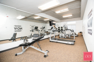
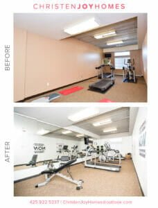
For the exercise room, we installed large mirrors and arranged the equipment to better fit the space. The result was an immediate transformation.
The Final Product
For this project, the challenge was to find the right balance between making it inviting and keeping it comfortable while still ensuring the pieces had great durability. Trying to meet all three of these goals certainly pushed the boundaries of my creativity.
While I personally was thrilled with the final results, in the end, it’s the client’s opinion that matters the most. Roers wanted a refresh that would offer residents an inviting and comfortable space to use and enjoy, and at the end of the project, I was confident I had delivered.
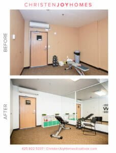
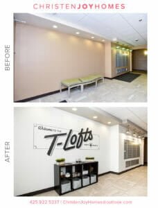
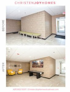
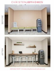
The day following project completion, residents were taking photos of the wall paintings, conversing on the couches, and playing shuffleboard. Seeing their excitement and how they were using the space meant the mission for the refresh had been accomplished.
While I loved the creativity this project required, it was the opportunity to incorporate so many local, talented artists that brought me so much joy. Their talents made my vision a reality, and knowing I’ve created an ongoing showcase for their work is so gratifying.”
__________________________________________________________________________________________________________________
If you’re interested in any of the businesses used for this project, here’s the complete list:
- Upper Hand Designs – Sign and painting design.
- Fargo Glass and Paint – Fitness room mirrors.
- J. Alan Paul – Photography in both common areas.
- Grain Designs – Stumps & high-top table.
- Wendt Cabinetry – Bathroom vanity & mirror
- Carpet World – Bathroom wall tile
Stay tuned for more guest blogs around my work with Roers. You can follow me on Instagram or Facebook, or contact me for more information for your own projects.

